Visual identity for a large‑scale corporate event during a global rebrand
Extravaganza 23 · Branding Lead
Client: Herbalife
Role: Branding Lead
Scale: 15,000+ attendees from 32+ countries
Scope: Adaptation of brand guidelines, attendee journey mapping, multilingual wayfinding, art direction, asset creation, supplier coordination and on‑site implementation
Branding Lead | Visual Identity | Event Design | Attendee Journeys | Wayfinding | Art Direction | Production Coordination | Multilingual UX
The challenge
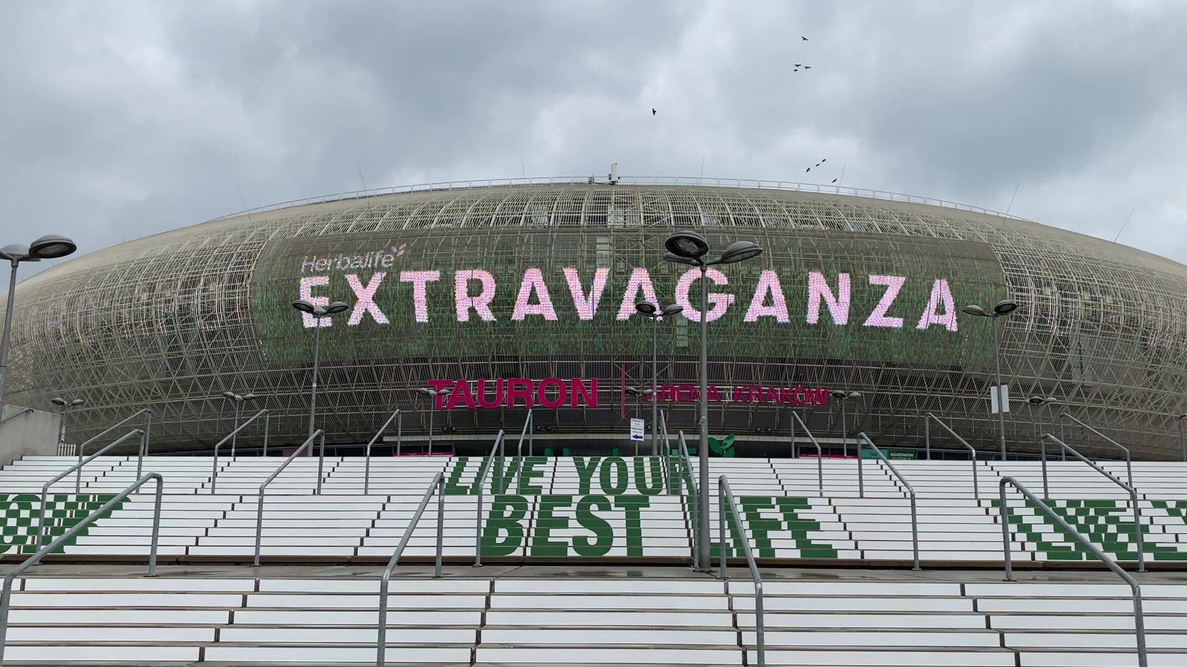
Extravaganza 23 took place during a major global rebrand. The central brand team defined the logo and the core assets, but the event needed a clear and practical translation of the new identity across hundreds of materials, multiple teams, tight timelines and a very busy venue.
The audience came from across the region and spoke more than 32 languages. This required a visual approach that was instantly understandable for people from different cultural and linguistic backgrounds. The goal was to build a unified story and create attendee journeys that were easy, intuitive and enjoyable for everyone.
My approach
I translated the global brand into a visual language tailored to a large, multilingual event. I focused on clarity, consistency and accessibility, using colour coding, intuitive shapes and simple iconography so attendees could navigate the venue regardless of language.
I developed practical guidelines and asset kits, aligned internal teams and suppliers, led a small design team and managed approvals throughout the process. Everything was designed to scale smoothly across pre‑event communication and on‑site graphics.
The work
I applied the new brand across every stage of the event experience:
Pre‑event communication including social posts and email graphics
Sub‑event and session branding aligned with the global identity
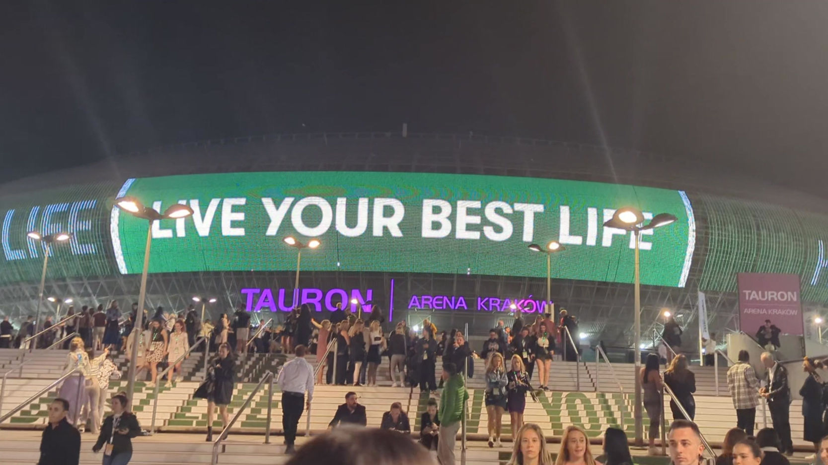
Multilingual‑friendly wayfinding with colour‑coded routes and intuitive icons
Directional signage designed to work even without reading the text
Large‑format graphics, screen visuals and entrance branding
Artwork guidance for expo booths so departments could personalise their spaces without breaking brand consistency
Ready‑to‑produce asset packs for internal teams and external suppliers
I worked closely with production partners, prepared artwork for print, supervised installation and ensured last‑minute needs did not break the visual logic or attendee journey.
The outcome
Extravaganza 23 became a clear and confident representation of the new global brand. Attendees from more than 32 language backgrounds could navigate the venue easily, internal teams produced with fewer questions, suppliers worked more accurately and the brand remained consistent from the first communication to the final on‑site experience.
The event also received the best branding feedback in the past ten years. Teams highlighted how strong the identity looked across the venue and how functional and intuitive the design was for both staff and attendees. The system held up at scale and provided a strong foundation for future editions.